DH-Mapping
Digital Humanities Theory and Practice
Jay Bowen, Digital Scholarship and Publishing Studio, University of Iowa Libraries Weeks 8 and 9: Digital Cartography
Credits
- The London of Sherlock Holmes, by Thomas Bruce Wheeler
- Descriptive Map of London Poverty 1889, from the David Rumsey Map Collection
- Place context analysis using Natural Language Processing, Bo Zhao
- Word2Vec, Sankalp Kolhe
- Google News and Leo Tolstoy: Visualizing Word2Vec Word Embeddings using t-SNE, Sergey Smetanin
Contents
- Week 8: Basic Tech and Techniques for Digital Cartography
- Static Mapping with QGIS
- Web Mapping with Leaflet JavaScript
- Week 9: Text Analysis, Geolocation, and Network Mapping with Python, QGIS, and Gephi
- Text Analysis with Python
- Conclusion
Week 8: Basic Tech and Techniques for Digital Cartography
Note: Before class, please download QGIS and Visual Studio Code, as discussed below.
In this class, we will walk through some of the basics of doing GIS in the digital humanities. For this, we will focus on open source approaches, making use of free desktop GIS software (QGIS), a versatile text editor (Visual Studio Code), and a nimble JavaScript library for web mapping called Leaflet. Using QGIS, we will see how to map a spreadsheet containing points of interest from the Sherlock Holmes series of detective stories. In this case, I downloaded these points from a pre-existing project (The London of Sherlock Holmes) and have cleaned and prepared this dataset for our purposes, but it is good to keep in mind that data preparation and cleanup are fundamental steps in most GIS work.
With QGIS, you will learn how to upload a csv file with latitude and longitude data to visualize points on a map. Then, you will bring in a scanned and georeferenced historic base map for more temporal authenticity. Also, you will learn how to label the mapped points and create a static map. Then, we will discuss the limitations of such a map for these data and consider how interactive web mapping might help improve things.
Using QGIS, we will export our csv data as a JavaScript-friendly GeoJSON file (later, we will look briefly at how to parse csv data directly). Using the local path to this new GeoJSON file, we will generate an interactive web map. Don’t worry! I have written the code for you. However, we will take a quick look at what the code is doing behind the scenes.
Finally, it is important to emphasize that our objective is not to develop an extensive understanding of GIS and web mapping techniques, but to learn what sorts of possibilities are available to you. Please let me know at any time if you would like to learn more.
Download QGIS Desktop Software
You can download the appropriate version of QGIS for your platform here. When doing so, please choose the option under the heading that states “long term release” as shown in the image below.
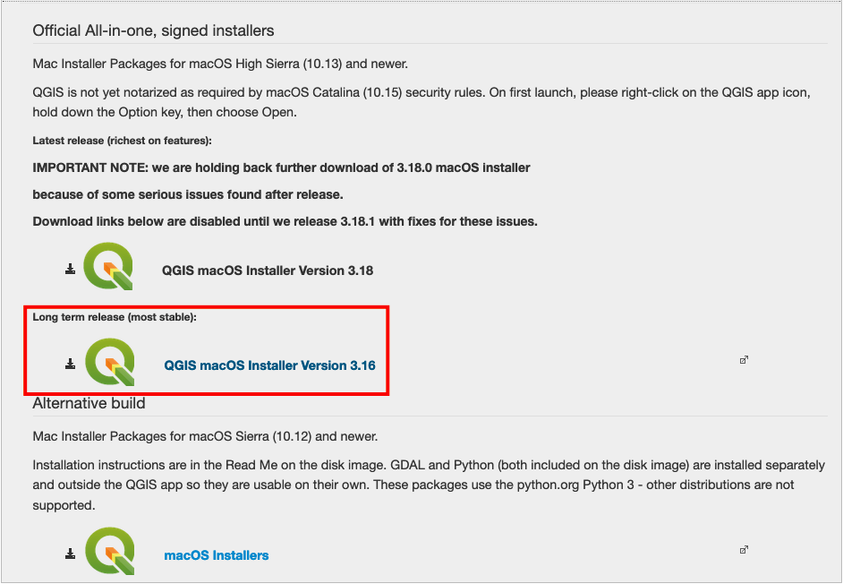
Figure 01. Download the long term release of QGIS.
As their site explains, QGIS is “a free and open source geographic information system,” which allows you to “create, edit, visualize, analyze, and publish geospatial information.” If you have done any mapping in the past, you may have worked with ArcGIS. Both allow you to do many of the same things in very similar ways. However, given our ongoing off-campus needs, I find that free software that you can run on a Mac is a nice option when you cannot make use of on-campus resources. The more that you use both, you will find that there is a lot of crossover, and the skills you learn in one will translate quickly to the other.
Download Visual Studio Code
A good text editor is a must for any code-intensive web cartography. Visual Studio Code describes itself as “a free, lightweight and extensible code editor for building web, desktop, and mobile applications” and fits the bill. You can download it here by clicking the download button as shown below.
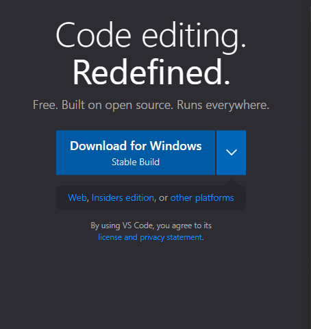
Figure 02. Download Visual Studio Code.
Building a web map from scratch requires some familiarity with coding in HTML, CSS, and JavaScript. In this class, we will take a look at what these are doing to make our web map work, but you will not be expected to write or implement any code. If you are interested in taking a deeper dive into this, let me know and I can point you in the direction of some good classes or work through the basics with you.
Download This Repository
Before opening QGIS, you should download this repository and save it to your desktop so that you can work with the files included here. Towards the top of this page, you should see a green button that says, “Code.” Click this and select “Download ZIP” from the options as shown in the image below.
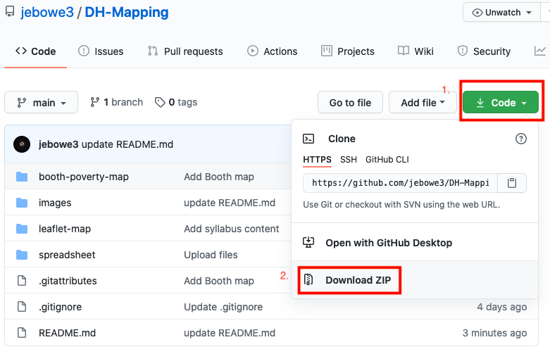
Figure 03. How to download this repository.
Unzip this folder and save it to your desktop. Within this folder, you will find a file called “SHERLOCK_HOLMES_LONDON.csv” inside the “spreadsheet” folder. If you open this file, you will see that it contains six columns (place, location, info, X, Y, and story). For mapping this spreadsheet, the important information is in the X and Y columns.
Every map is essentially a chart with X and Y axes (you may also see Z for elevation). Think of a map oriented with the top of the sheet at north. As the X axis moves from left to right, the X column stores longitude data (degrees east or west of Greenwich, England). As the Y axis moves from bottom to top, this column stores the latitude information (degrees north or south of the Equator). Close the csv file and open QGIS.
Static Mapping with QGIS
Step 1: Upload the Sherlock CSV to QGIS
Upon opening QGIS, you should notice a dropdown option called “Layer” in the bar at the top of your screen. Click this and select “Add Layer.” Then select “Add Delimited Text Layer” from the options provided.
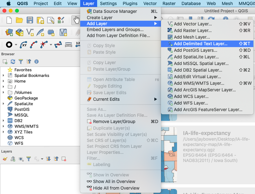
Figure 04. Option to add a spreadsheet in QGIS.
This will open a form. In the box next to “File name,” include the path to the csv file. You can navigate to it by pressing the button with three dots to the right of this box. After doing so, the rest of this form should complete automatically. If not, make sure to select “CSV” under “File Format,” click “Point coordinates” under “Geometry Definition,” select “X” for “X field” and “Y” for “Y field,” and make sure that “Geometry CRS” is set to “EPSG:4326 - WGS 84.” Then, click “Add.” The form should appear as follows.
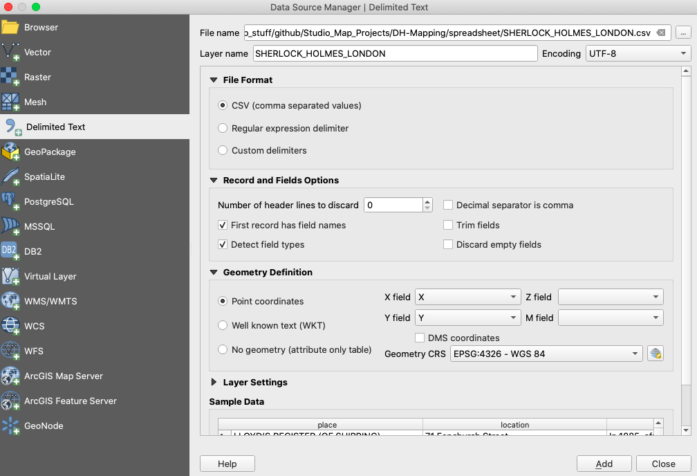
Figure 05. How to fill out the form to add a delimited text layer.
Step 2: Adding a Base Map
After clicking add, you should see a collection of points on a white background in your map edit window. Not being sure if these points are actually in London, we need a base map for visual verification. You can add one by clicking “XYZ Tiles” in the browser window at the top left corner. Select “OpenStreetMap” and drag and drop this into your map window. Next, in the layers window, make sure to drag the base map under the Sherlock points.
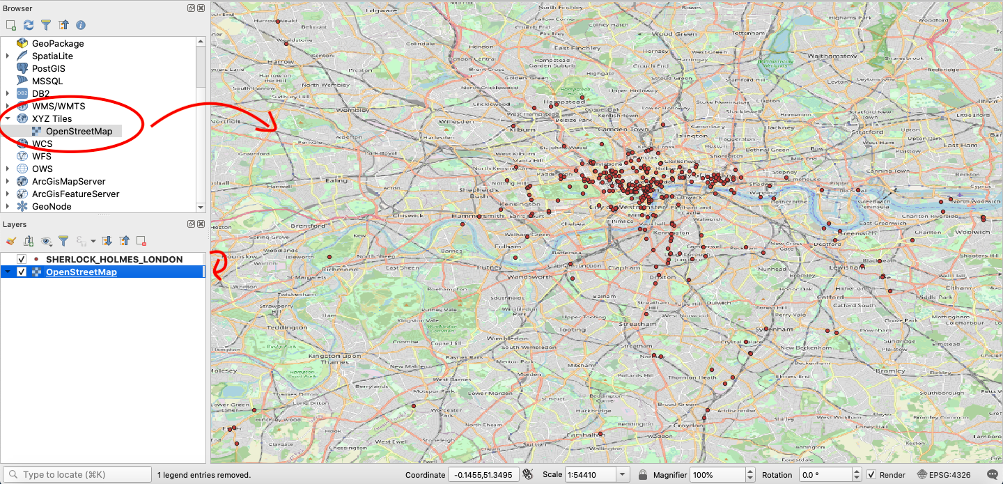
Figure 06. Add a base map and place it beneath the points.
Step 3: Changing Projections
Things look good, but if you look at maps for a living, this map looks a little squished. This illustrates the importance of projections. Every map is an abstraction of the Earth’s natural curvature to a flat surface, so some projections are better than others for particular locations. In this case, it would be good to use a projection developed specifically for London, such as EPSG:102400 (London Survey Grid). In the bottom right corner of your window, you should see a little button that looks like a globe wearing a hat, followed by an EPSG code. This is where you can change your projection. Click on this and, in the form that opens, type “102400” into the “Filter” box. You should now see “London_Survey_Grid” appear in the box beneath “Predefined Coordinate Reference Systems.” Click it and then click “OK.” After you change the projection, your map should be a little easier on the eyes.
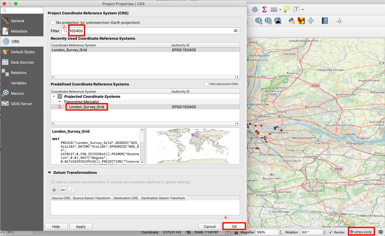
Figure 07. How to change the projection.
GIS users are trained to think of mappable data in two main categories - vector and raster. Vector data consist of distinct points, lines, and polygons. The spreadsheet data that you have mapped is one example of vector data. In contrast, raster data consist of continuous pixels. A scanned map is an example of raster data. We are now going to add some new raster data to our map.
Step 4: Adding a Georeferenced Historic Base Map
Adding an historic base map to your project is a nice way to give your map historical context. Using GIS software, you can take any scanned map and “rubber sheet” it to your project in a painstaking process known as georeferencing. Essentially, this is a process of placing a series of pins on your scanned map and linking them to a series of matching pins in your map edit window. After you have done this, you can run a tool in GIS to assign coordinates to each pixel on your scanned map. Luckily, there are several online resources, like the David Rumsey Map Collection, that provide scanned maps that are already georeferenced. I have downloaded and placed one of these maps in the “booth-poverty-map” folder.
** ADDENDUM: As this file was quite large, it seems that it may not be downloadable from GitHub. Instead, please navigate to the shared document in our Google Drive folder and download the tif file from there. Please replace the tif file in the “booth-poverty-map” folder with this one and continue as described below. **
Similar to how you added the csv data, click “Layer” in the bar at the top of the screen. Then, click “Add Layer” and “Add Raster Layer.” This will open a form.
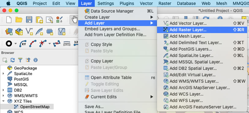
Figure 08. How to add a raster layer.
In the form that opens, navigate to and select the file called “Booth_Descriptive_Map_of_London_Poverty_1889.tif” located in the repository you downloaded. Then, click “Add.”
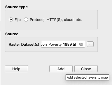
Figure 09. The form for adding a raster layer.
After adding the georefenced raster, you should see Booth’s 1889 map of London poverty in your map edit window. Again, make sure to drag this map beneath the points in the layers window. The result should look something like this:
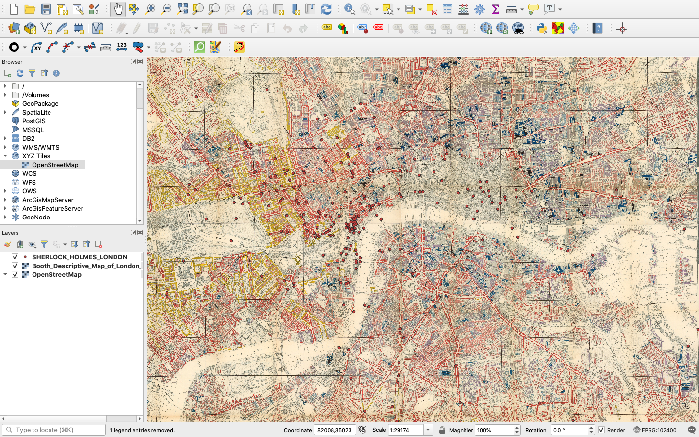
Figure 10. The Booth map in QGIS.
Step 5: How to Label Points and Change Symbology
Looking at the map in progress, you will see a bunch of points over an old map of London. It is neat to zoom in and out on this map, but the points don’t really mean anything without some legible data attached to them. We should probably add some labels to these undifferentiated points.
First, right click over the points layer in the table of contents and select “Properties.”
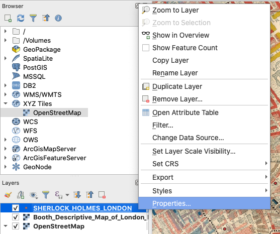
Figure 11. Editing layer properties.
Then, select “Labels” and, in the form that opens, make sure that you select “Single labels”, use “place” for “Value,” “Bodoni 72 Oldstyle” for “Font,” “Bold” for “Style,” “12” for “Size,” and click “OK.” The form should be filled as follows:
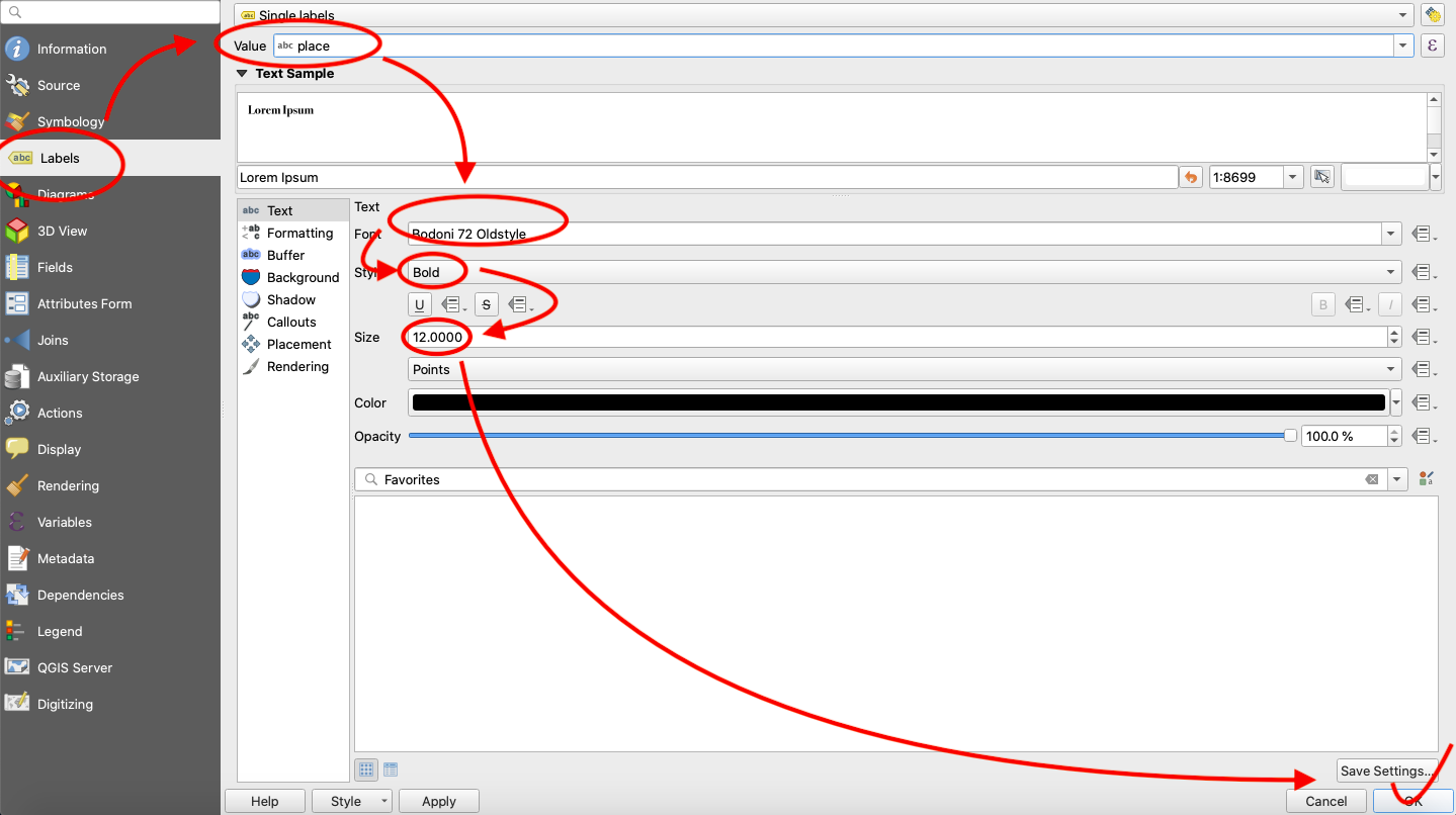
Figure 12. Label form options.
Now that you have labeled the points, let’s edit the appearance of the points. Go back the properties options for the layer and, instead of “Labels,” choose “Symbology.” Fill out the form as follows, choosing “diamond red” and clicking “OK.”
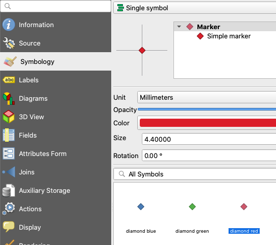
Figure 13. How to change symbology.
After returning to the map, behold the clutter! This is one of the drawbacks of static mapping with this type of data. There is just way too much on the map and no good way to filter it. This being said, we are going to extract points for a single story for a more legible map. “The Adventure of the Noble Bachelor” sounds exciting enough, so let’s select that.
Step 6: Creating a New Layer from a Selection
Again, right click on the points layer in the table of contents and choose “Open Attribute Table.” At the top of the attribute table, click the button for the “Select features using an expression” tool. In the expression box, type “story” = ‘The Adventure of the Noble Bachelor’ and click “Select Features” in the bottom right corner.
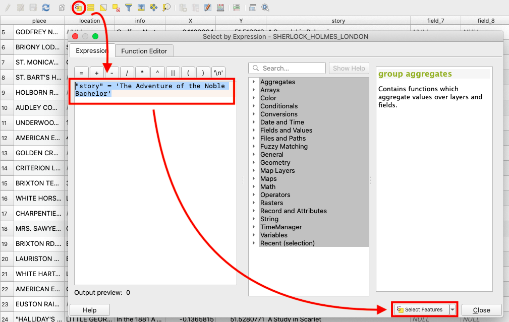
Figure 14. Selecting features by an expression.
After closing the attribute table and returning to the map edit window, you should see a few points highlighted in yellow. You can save these selected points as a new layer by right clicking the points layer once again, choosing “Export,” and by clicking “Save Selected Features As.”
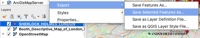
Figure 15. Saving selected features.
In the form that follows, set the format to “GeoJSON” and call the file “noble_bachelor_points.geojson” (making sure you have no spaces in your file names is necessary for successful coding) and save this in the root of the repository that you saved to your desktop. Next, set the CRS to “EPSG:4326 - WGS 84” and set your coordinate precision to 5 decimal points. Make sure that you check the box next to “Add saved file to map” and click “OK.”
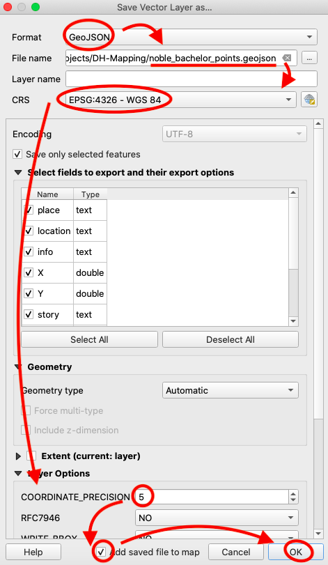
Figure 16. Filling out the export features form.
Now, uncheck the original points layer in your table of contents so that you only see the Noble Bachelor points in your map edit window and zoom into these points. Again, using the methods outlined above, change the properties of this layer so that the points appear as diamonds and feature single labels. As a challenge, try making these diamond markers green. Also, in addition to making the labels Bold 12 pt Bodoni 72 Oldstyle, add a 1 mm white buffer around the text to make it more visible on the map. The result should look like this:
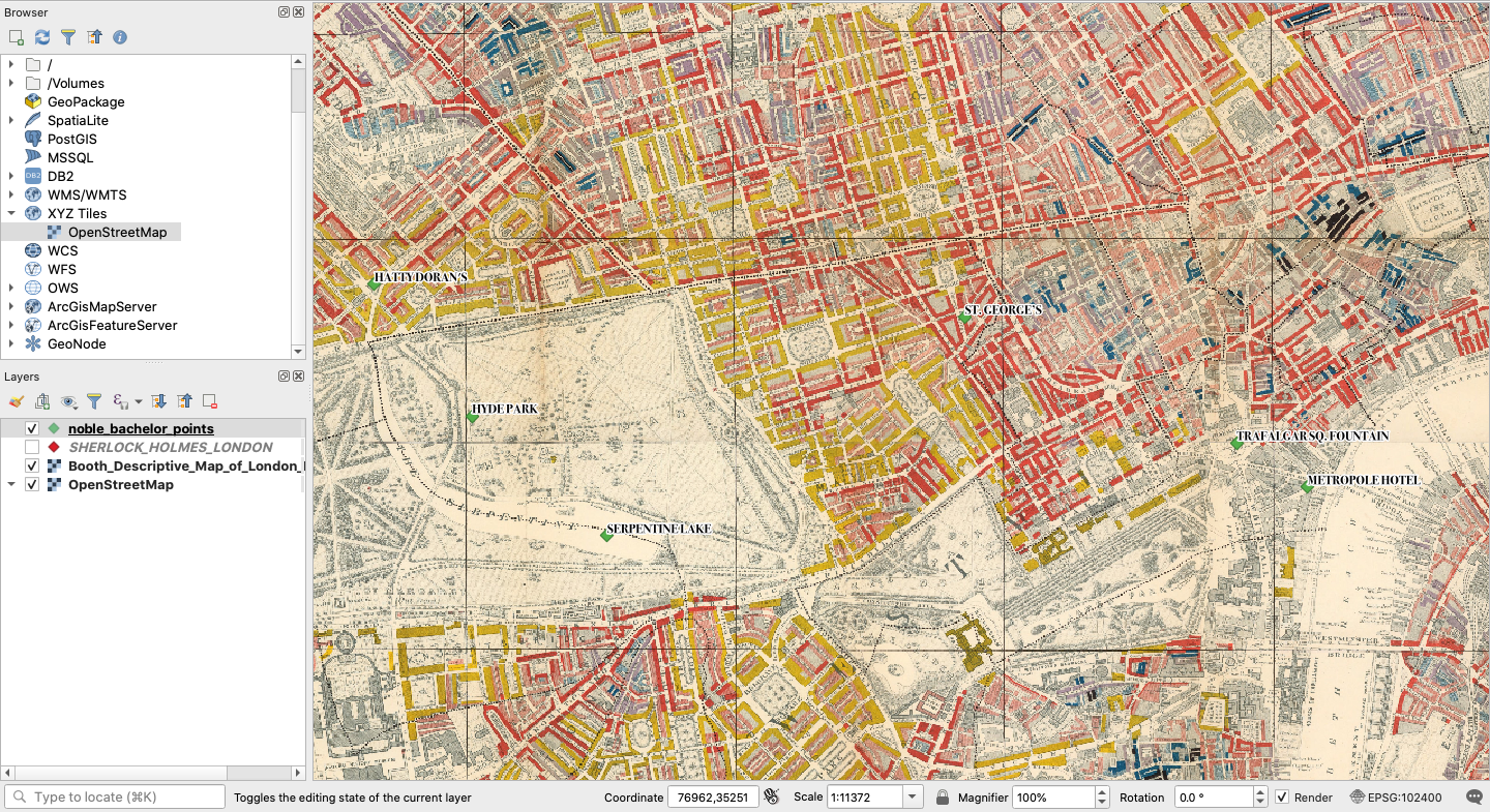
Figure 17. The Noble Bachelor points in a map edit session.
Step 7: How to Make a Static Map
Now we are ready to make the map. In the edit window, make sure you are zoomed in on the Noble Bachelor points and that all labels are legible. Now, from the options in the bar at the top, choose “Project” and “New Print Layout” or simply hold the command key and press “P” to open a print layout session. A box will appear prompting you to add a print layout title. Let’s call this “Noble_Bachelor_Map.”
In the print layout screen that opens, you will want to click the button on the lefthand bar that “adds a new label to the layout.” This will allow you to add a title to the map.
Figure 18. The add new label button.
Next, drag your cursor to make a box for the title across the top. In the item properties box to the right, type “Points of Interest from The Adventure of the Noble Bachelor” in the box, replacing the placeholder text. Then, change the font size to 25 pt and make sure your title box is big enough to display the full title.
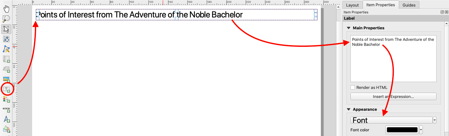
Figure 19. Adding a title.
Next, you will need to click the “adds a new map to the layout button” as shown below.
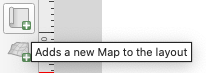
Figure 20. The adds a new map to the layout button.
Just as you did with the title, drag the cursor across the page to add the map. You can move and resize this after you add it. The result should look something like this:
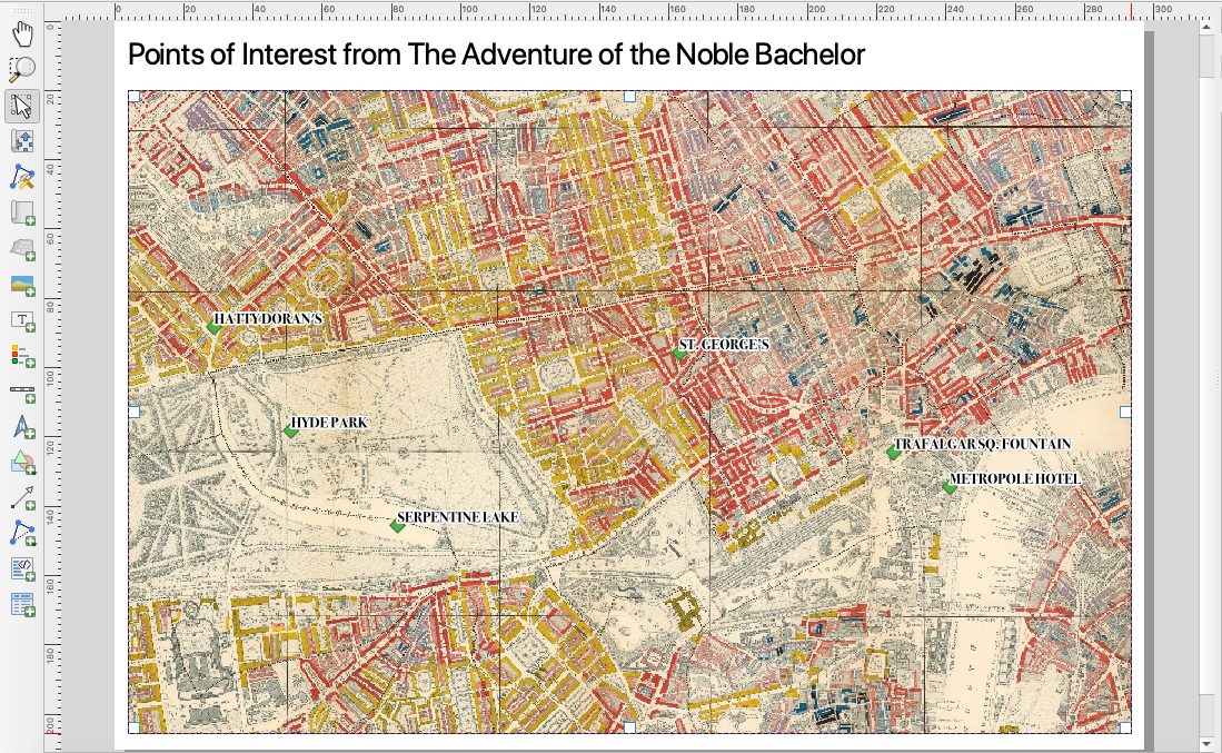
Figure 21. The map added to the print layout.
Using a similar process, see if you can add and style a north arrow in the bottom right corner and a scale bar in the bottom left corner so that your map looks like this:
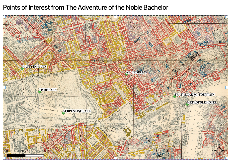
Figure 22. The finished map layout.
Now, your map is ready to export to a printable pdf. At the top of the layout edit window, you will find a button called “Export as PDF.” Click this and save your map inside your project folder. Congratulations! You have created a printable static map.
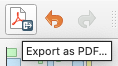
Figure 23. Export a PDF.
Web Mapping with Leaflet JavaScript
Step 1: Export a GeoJSON File for Web Mapping
The results are okay, but in the 21st Century, we can do better. Let’s take a look at how web mapping with our point data can expand the amount of data we can map and deliver the map user a better and more rewarding interactive experience. The first thing we need to do is to export a new GeoJSON file with all of our Sherlock points.
Return to the map edit window and right click the layer with all of the points (not just the Noble Bachelor points) and click “Export” and “Save Features As.” Again, make sure you export in GeoJSON format. Click the three dots next to “File name,” save as “sherlock_points,” and make sure to save the file inside the “data” folder within the “leaflet-map” folder inside the repository that you downloaded to your desktop. Finally, set coordinate precision to 5 decimal points. You could go with the default 15, but that level of coordinate precision is generally unnecessary and simply makes for heavier files.
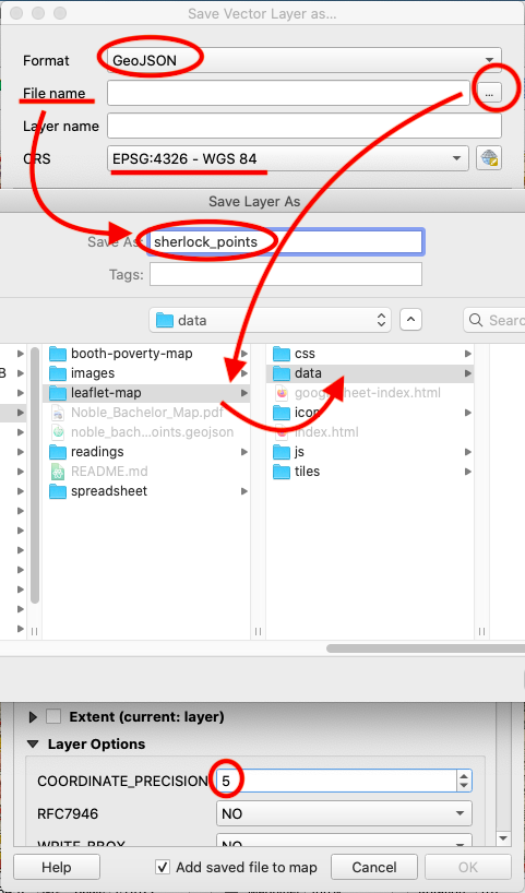
Figure 24. Export all of the Sherlock points.
Step 2: Download Visual Studio Code
Now we are ready to open our “leaflet-map” folder and do some minor editing in Visual Studio Code. Open the repository that you downloaded to your desktop. Locate the folder called “leaflet-map.” Drag and drop this entire folder over the blue Visual Studio Code icon on your desktop. This should open all of the web map components within a Visual Studio Code edit session. In the bar at the left, open the file called “index.html” so that you can see all of the code behind the web map. Your screen should look like this:
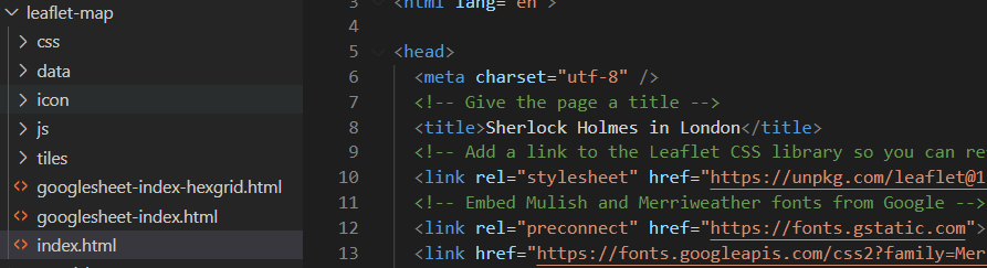
Figure 25. Editing in Visual Studio Code.
The first thing that you will want to do so that you can check your progress is to download an extension called “Live Server.” Hover over the icons in the far-left bar in the bar, Find and click “Extensions.” Search for “Live Server” and click “Install” on the first result.
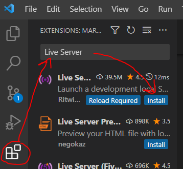
Figure 26. Installing Live Server.
Now you can check the progress of edits to your web map with a locally hosted server. To test it out, with the index.html file open, click “Go Live” in the right corner inside the blue bar at the bottom of the Visual Studio Code window. You may also need to click on the “leaflet-map” folder if you are presented with a menu. This will open the map in your web browser.
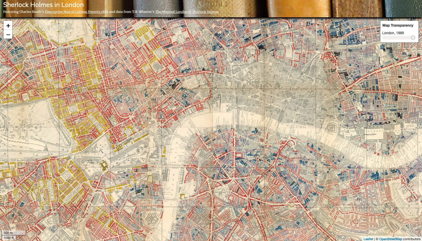
Figure 27. The initial web map in Live Server.
The map should look like the image above. You will notice that one interactive feature is already on the map. In the top right corner, there is a slider control that changes the opacity value of the historic base map tiles so that you can see the contemporary map of London underneath. Already, we can see how the web map offers a little more to the experience of the map user.
Step 3: Add the Sherlock GeoJSON to a Web Map Using Visual Studio Code
You’ll notice that there are no points on the map. That is because we have not directed the JavaScript within the index.html file to the GeoJSON file holding the points. Remember that the local path to the Sherlock points is ‘data/sherlock_points.geojson’ and that we will need to add this path to the index.html file. Scroll through the index.html file until you see the following lines of JavaScript:
// use jquery to load GeoJSON data
$.when(
  $.getJSON(/* 'ADD PATH TO GEOJSON DATA HERE' */)
  // when the files are done loading,
  // identify them with names and process them through a function
).done(function(sherlockPts) {
Replace /* ‘ADD PATH TO GEOJSON DATA HERE’ */ with ‘data/sherlock_points.geojson’ so that those lines of JavaScript now look like this:
// use jquery to load GeoJSON data
$.when(
  $.getJSON('data/sherlock_points.geojson')
  // when the files are done loading,
  // identify them with names and process them through a function
).done(function(sherlockPts) {
Now, save your edits to the index.html file and refresh your web map in Live Server. You should notice a lot of blue markers now appear. Hover over them and you will see detailed descriptions of each points. Also notice that there is a filter button under the zoom control in the top left corner. If you click on this, you will see that you can filter the points by story name.
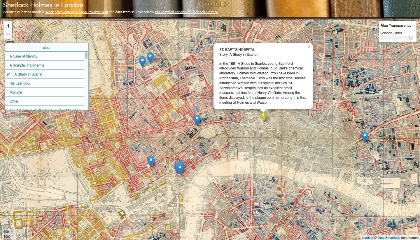
Figure 28. The finished web map in Live Server.
Step 4: Explanation of the Code Behind the Web Map
You may be wondering what the all of this code in the index.html file is doing. If not, feel free to skip this section, but if so, the following describes the main components of this code.
First, at the top of the document, you will notice some links to different CSS libraries as well as some CSS code between the style tags. This code is what styles the map. By changing this, we can change things like the font sizes, header content, and page layout.
Next, you will notice that we are calling in a few JavaScript libraries within script tags. The most important of these is the Leaflet JavaScript library (“https://unpkg.com/leaflet@1.6.0/dist/leaflet.js”). The JavaScript is what allows you to manipulate and visualize the data presented in the map. Within this code, the following…
// define map options
const mapOptions = {
  center: [51.507842896935315, -0.11123930420231712], // center the map on the coordinates for London
  zoom: 14,
  minZoom: 10,
  maxZoom: 16,
};

// define the map with the options above
const map = L.map("map", mapOptions);
defines the map options, such as the initial, maximum, and minimum zoom settings, as well as the central coordinates of the map. These options are then added to a Leaflet method ‘L.map()’ that instantiates our map and defines it with a constant for future reference in our code.
// add a base map to the map
L.tileLayer('https://{s}.tile.openstreetmap.org/{z}/{x}/{y}.png', {
minZoom: 10,
maxZoom: 16,
attribution: '© <a href="https://www.openstreetmap.org/copyright">OpenStreetMap</a> contributors',
}).addTo(map);
The code above adds the open street map base tiles to our map, while the following code…
// Overlay layers (TMS)
const london1889 = L.tileLayer('tiles/{z}/{x}/{y}.png', {
  tms: true,
  minZoom: 10,
  maxZoom: 16,
}).addTo(map);

// Give overlay layers (london1889) a title for the opacity control
const overMap = {
  "London, 1889": london1889
};

// The opacity control
L.control.opacity(
  overMap, {
    label: "<b>Map Transparency</b>" // Give the control a title
  }
).addTo(map);
adds the tiles for Booth’s 1889 map of London poverty as an overlay, feeds them to the opacity control, and adds this control to the map.
Next, there is some code adding a scale bar to the map, followed by…
// use jquery to load GeoJSON data
$.when(
  $.getJSON('data/sherlock_points.geojson')
  // when the files are done loading,
  // identify them with names and process them through a function
).done(function(sherlockPts) {});
which gets ready to perform a function on the Sherlock points after it loads the GeoJSON file containing them. Inside this function, is the following large block of code:
// initiate a leaflet GeoJSON layer with L.geoJson, feed it the Sherlock data, and add to the map
const sholmes = L.geoJson(sherlockPts, {
  pointToLayer: function(feature, latlng) {
    var tags = []; // declare an empty array for filter tags
    tags.push(feature.properties.story); // push story name from the GeoJSON feature properties to tags array
    return L.marker(latlng, {
      tags: tags,
      icon: L.icon({
        iconUrl: 'https://raw.githubusercontent.com/pointhi/leaflet-color-markers/master/img/marker-icon-2x-blue.png',
        shadowUrl: 'https://cdnjs.cloudflare.com/ajax/libs/leaflet/0.7.7/images/marker-shadow.png',
        iconSize: [25, 41],
        iconAnchor: [12, 41],
        popupAnchor: [1, -34],
        shadowSize: [41, 41]
      })
    });
  },
  // for each feature...
  onEachFeature: function(feature, layer) {

    // declare an empty string variable
    var ptLocation = "";

    // if the location is present...
    if (layer.feature.properties.location != null) {
      // define ptLocation as...
      var ptLocation = "<br>" + layer.feature.properties.location;
      // otherwise...
    } else {
      // make sure it remains an empty string
      var ptLocation = "";
    };

    let popUp = (layer.feature.properties.place + ptLocation + "<br>Story: " + layer.feature.properties.story + "<br><hr>" + layer.feature.properties.info);

    layer.bindPopup(popUp);
    layer.on('mouseover', function(e) {
      this.openPopup();
      e.target.setIcon(new L.icon({
        iconUrl: 'https://raw.githubusercontent.com/pointhi/leaflet-color-markers/master/img/marker-icon-2x-yellow.png',
        shadowUrl: 'https://cdnjs.cloudflare.com/ajax/libs/leaflet/0.7.7/images/marker-shadow.png',
        iconSize: [25, 41],
        iconAnchor: [12, 41],
        popupAnchor: [1, -34],
        shadowSize: [41, 41]
      }));
    });
    layer.on('mouseout', function(e) {
      this.closePopup();
      this.setIcon(L.icon({
        iconUrl: 'https://raw.githubusercontent.com/pointhi/leaflet-color-markers/master/img/marker-icon-2x-blue.png',
        shadowUrl: 'https://cdnjs.cloudflare.com/ajax/libs/leaflet/0.7.7/images/marker-shadow.png',
        iconSize: [25, 41],
        iconAnchor: [12, 41],
        popupAnchor: [1, -34],
        shadowSize: [41, 41]
      }));
    });
  }
}).addTo(map);
This code defines a layer with “const sholmes = L.geoJson(…)” and then builds this layer with blue png marker icons. It also pushes the values in the “story” column into an empty array defined as “tags” so that we can then append these to the markers and use them to filter the markers with the filter control. Next, the code defines the popup content, using the “location”, “place”, “story”, and “info” columns. It tells the layer to open the popup and change the icon to a yellow marker when it detects a mouseover event. It also tells the layer to close the popup and change the icon back to a blue marker when it detects that the user has moved the mouse off the marker. The code then adds this layer to the map.
Finally, the following code…
// add a tag filter button to the map with all of the Sherlock Holmes story titles
L.control.tagFilterButton({
  data: ["A Case of Identity", "A Scandal in Bohemia", "A Study in Scarlet", "His Last Bow", "Multiple", "Other", "The Adventure of Charles Augustus Milverton", "The Adventure of Lady Frances Carfax",
    "The Adventure of Shoscombe Old Place", "The Adventure of the Beryl Coronet", "The Adventure of the Blanched Soldier", "The Adventure of the Blue Carbuncle", "The Adventure of the Bruce-Partington Plans",
    "The Adventure of the Cardboard Box", "The Adventure of the Copper Beeches", "The Adventure of the Creeping Man", "The Adventure of the Dancing Men", "The Adventure of the Devil's Foot", "The Adventure of the Dying Detective",
    "The Adventure of the Empty House", "The Adventure of the Engineer's Thumb", "The Adventure of the Golden Pince-Nez", "The Adventure of the Greek Interpreter", "The Adventure of the Illustrious Client",
    "The Adventure of the Mazarin Stone", "The Adventure of the Missing Three-Quarter", "The Adventure of the Musgrave Ritual", "The Adventure of the Naval Treaty", "The Adventure of the Noble Bachelor",
    "The Adventure of the Norwood Builder", "The Adventure of the Priory School", "The Adventure of the Red Circle", "The Adventure of the Resident Patient", "The Adventure of the Retired Colourman",
    "The Adventure of the Second Stain", "The Adventure of the Six Napoleons", "The Adventure of the Solitary Cyclist", "The Adventure of the Speckled Band", "The Adventure of the Stock-Broker's Clerk",
    "The Adventure of the Sussex Vampire", "The Adventure of the Three Gables", "The Adventure of the Three Garridebs", "The Adventure of the Veiled Lodger", "The Adventure of the Yellow Face", "The Adventure of Wisteria Lodge",
    "The Final Problem", "The Five Orange Pips", "The Hound of the Baskervilles", "The Illustrious Client", "The Man with the Twisted Lip", "The Musgrave Ritual", "The Problem of Thor Bridge", "The Red-Headed League",
    "The Sign of the Four", "The Valley of Fear"
  ],
  filterOnEveryClick: true,
  icon: '<img style="font-size:18px; padding-top: 6px;" src="icon/filter.png">'
}).addTo(map);
instantiates a filter control and provides all of the Sherlock Holmes stories in the “data” array. Then, it adds this control to our map.
Step 5: Crowdsourced Web Mapping with Google Sheets
With a few slight changes to our index.html code and a JavaScript library called PapaParse, we can parse a Google Sheet directly and add this content to map markers. Within the repository you downloaded, there is another html file at ‘leaflet-map/googlesheet-index.html’ that generates markers and popup content from our shared Google Sheets spreadsheet.
In Visual Studio Code, open the googlesheet-index.html file and take a quick look at the code. We are going to point our browser to this html file instead of the index.html file we viewed previously.
This time, run Live Server again, but add ‘/googlesheet-index.html’ to the url in the browser address bar. You should see a similar map load in your browser, with one important distinction. Notice how the first entry in our Google Sheets document contains an image link in a column titled “images.” If you go back to the map in Live Server, filter for The Five Orange Pips in the story filter and click on the marker in the city center for Lloyd’s Register, you will notice that this popup contains the image from that web link.
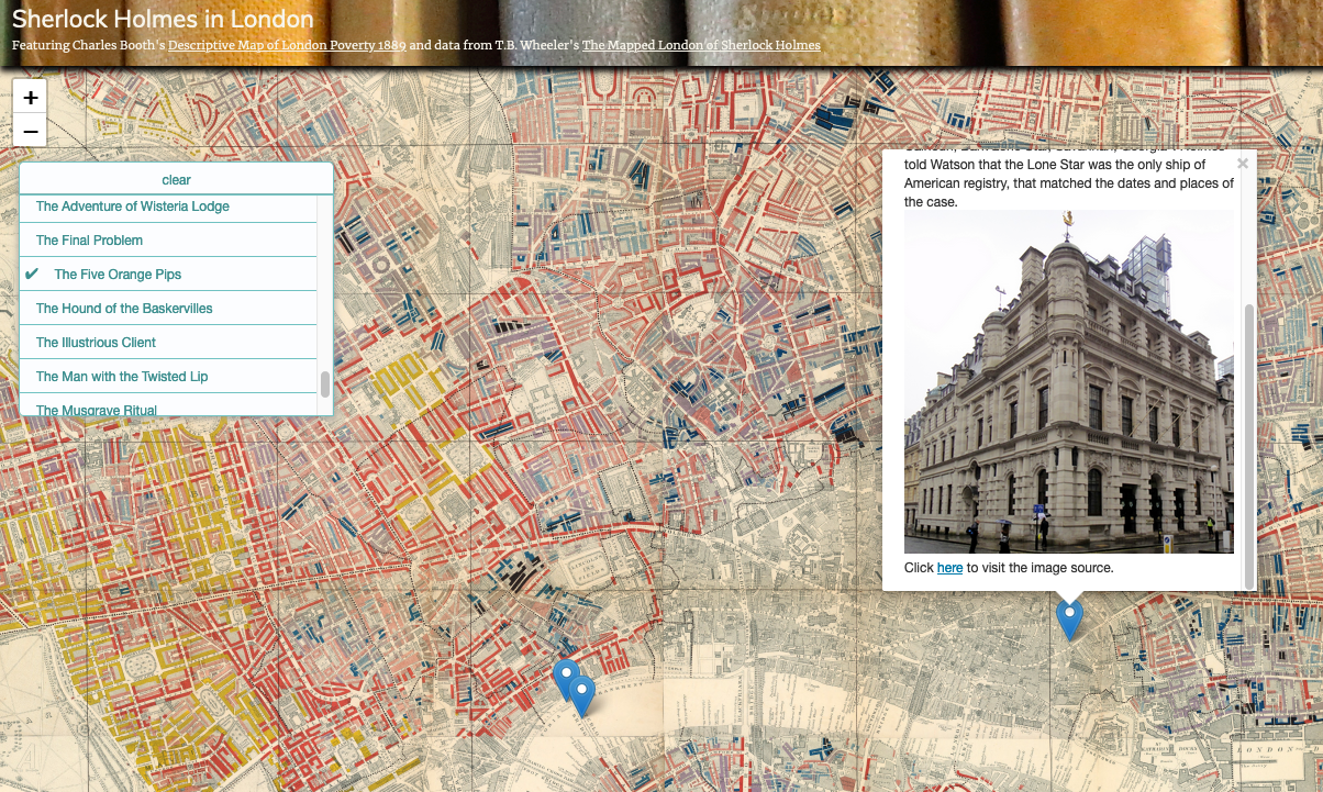
Figure 29. A popup with an image.
Now, let’s experiment with crowdsourcing popup image content using Wikimedia Commons. Return to our shared Google Sheets spreadsheet and find an entry missing an image url in the “images” column for which there is likely to be an image (a train station, cathedral, institution, etc.).
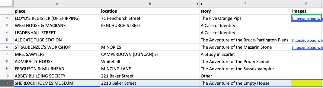
Figure 30. An empty entry in the images column.
Next, search for an image of that location at Wikimedia Commons as shown below.
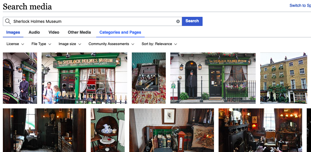
Figure 31. Search for an image at Wikimedia.
Now, right click on the image you want to use and select “Open Link in New Tab” as shown below.
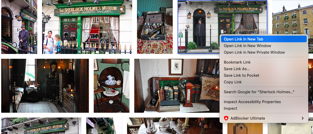
Figure 32. Open link in new tab.
In the new tab, to the right of the image, you will see an option to “use this file on the web”. Click this and copy the link from the box under “File URL” as shown below.
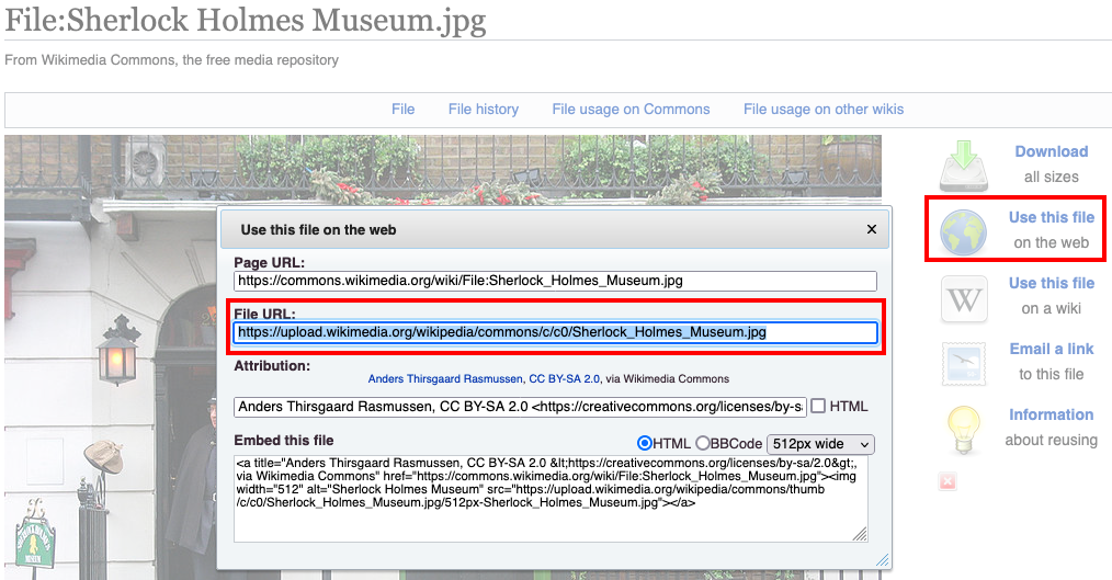
Figure 33. Copy the image url.
Paste this link into the empty entry in the images column of the shared google spreadsheet. Return to your googlesheet-index.html in Live Server and make sure to refresh the page. Now, when you hover over the marker for the image you just entered, you should see your added image in the popup content (it may take a moment).
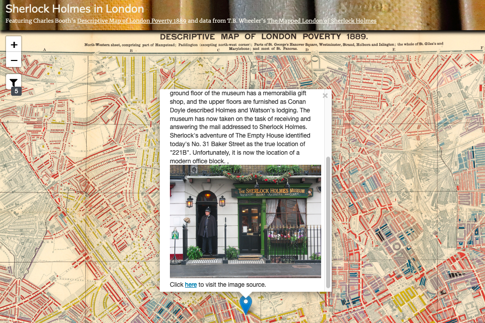
Figure 34. Image added to popup.
While you have made two maps that you can host locally on your computer, you may be wondering how you can host and publish these maps on the web. GitHub is a nice solution where you can share your code and publish your maps. If you are interested in doing this, please take a look at the link here.
Now that you have seen some of the potential for JavaScript in interactive web mapping, let’s take a look at how Python scripting can help us to analyze and map texts geographically and conceptually.
Week 9: Text Analysis, Geolocation, and Network Mapping with Python, QGIS, and Gephi
Note: Before class, please download Gephi for mapping networks.
This week, we will dive a bit deeper into the possible applications of digital mapping in the humanities. First, we will use some powerful Python modules, packages, and libraries that will read through the Adventures of Sherlock Holmes and measure the proximity of associated words in the text, as well as pull out all of the places mentioned in the stories. From this, we will experiment with mapping the frequency of mentioned places with QGIS, generating word clouds, and mapping networks between common words and their most similar partners in the text. These networks can tease out and visually represent thematic connections within the analyzed text, while our map of mentioned locations can elucidate the author’s, or a character’s, sense of place.
Download Gephi
Now, click the following link to download Gephi.
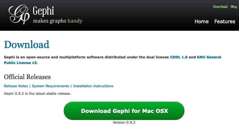 Figure 35. Downloading Gephi.
With Gephi, you can produce a wide range of visual analytics. We will be using Gephi to map networks between common words/themes in the Adventures of Sherlock Holmes.
Text Analysis with Python
If you foresee doing a lot of Python scripting in the future, it will be helpful to download Anaconda Navigator for setting up environments where you can test and run Python code inside a Jupyter Notebook file. However, in this example, we will run a Jupyter Notebook file within a pre-established environment in a GESIS Notebooks Binder in our web browser. You can open this by clicking this link.
Step 1: Open the ipynb File in Jupyter Notebook
After the binder finishes loading in your browser, click and open the “place-analysis.ipynb” file in the menu on the left side of the screen.
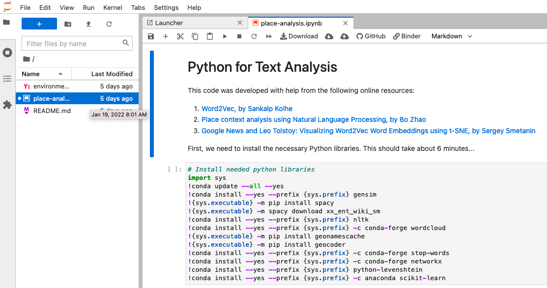
Figure 36. Open the ipynb file.
Follow the steps listed in the opened file, making sure to read through the explanations before running each block of Python code. The code included in the ipynb file will do the following:
- Download and save a txt file containing The Adventures of Sherlock Holmes
- Make and save a Word2Vec model for text analysis
- Create and save a word cloud of the the top 50 important words in the text
- Create and save a word cloud of the the top 50 locations mentioned in the text
- Save a csv file of all mentioned locations along with frequency counts for each
- Save a revised csv file of cleaned and corrected locations along with frequency counts and coordinates for each
- Generate a gexf file for mapping networks between the 50 most common important words from the text and the twenty most similar words to each
Step 2: Save Required Files in the Project Folder
After running the code, you should see several new folders in the table of contents at left. We will use some of the contents from the csv and gephi folders in the following steps, so we need to get these files into our desktop project folder.
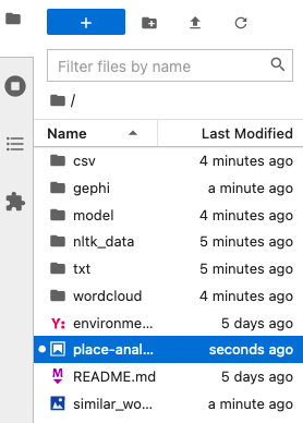
Figure 37. New folders in Jupyter Notebook.
First, notice the folder inside your desktop project folder called “assets” where we will save these files. Then, click and open “csv” in Jupyter Notebook. Right click “adv-sherlock-places-geocoded.csv” and click “Download” in the dropdown menu as shown below. Place this file inside your “assets” folder.
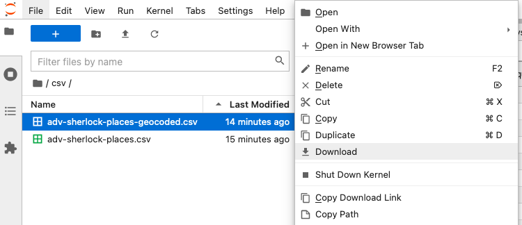
Figure 38. Download the geocoded locations.
Now, follow the same process for the “adv-sherlock.gexf” file in the “gephi” folder, saving this in the “assets” folder as well.
Now, we are ready to map the locations our Python code has retrieved and geocoded from the text of The Adventures of Sherlock Holmes.
Step 3: Map Locations in The Adventures of Sherlock Holmes with QGIS
Using the “adv-sherlock-places-geocoded.csv” file in QGIS, we will experiment with three different presentations of the locational frequency data to map Sherlock Holmes’s sense of place: heat mapping, proportional circles, and point in polygon analysis using the “nations.geojson” file.
First, open QGIS, choose Web > QuickMapServices > Search QMS (You may need to install the QuickMapServices Plugin first). Now, search for “Dark Matter” and add this tile service as your basemap.
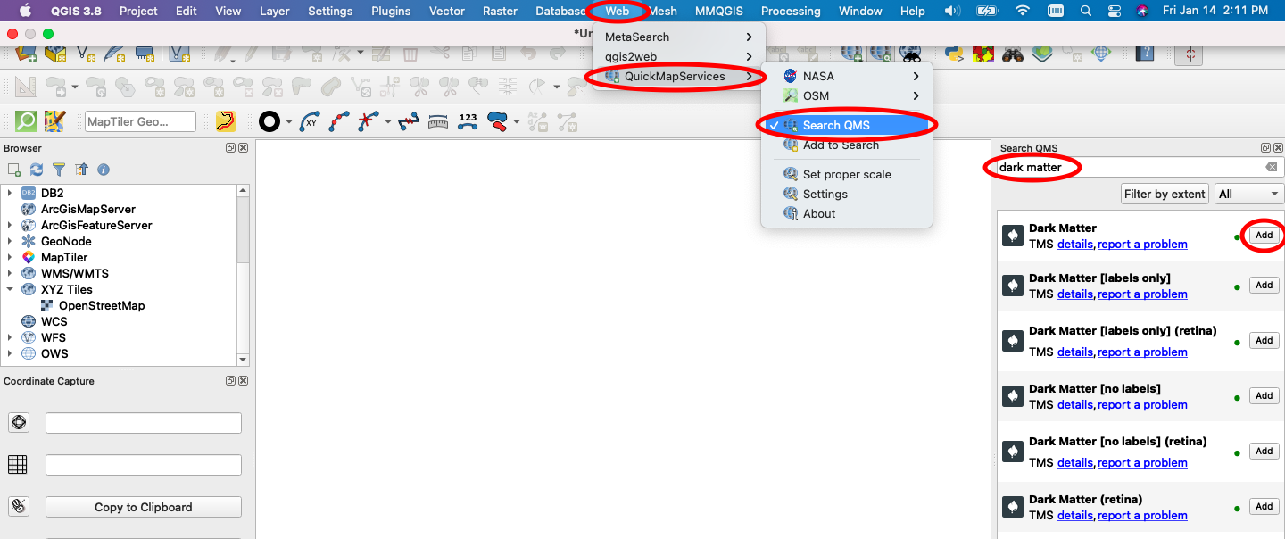 Figure 39. Add Dark Matter Basemap.
Second, add the “adv-sherlock-places-geocoded.csv” file as points. To do this, choose Layer > Add Layer > Add Delimited Text Layer. Then, a dialog box will open.
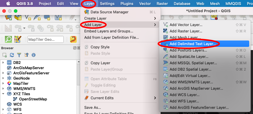 Figure 40. Add Delimited Text Layer - Step 1.
In the dialog box, select the “adv-sherlock-places-geocoded.csv” file next to “File name”. Next, under “Geometry Definition”, choose “Point coordinates” and set “X field” as “lng” and “Y field” as “lat”. Make sure that the “Geometry CRS” is EPSG:4326 and click “Add”. You can see a completed dialog box below. After adding, you should see all the mentioned mappable locations from The Adventures of Sherlock Holmes plotted as points in the QGIS map window.
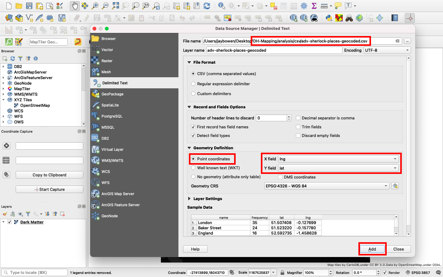 Figure 41. Add Delimited Text Layer - Step 2.
Third, let’s make these points appear as proportional circles. Find the layer in the “Layers” table of contents in the lower lefthand corner and right click. Select “Properties” and choose “Symbology” from the options at left. Instead of “Single symbol”, choose “Graduated”. For “Column”, choose “frequency” (If using a Windows PC, you will look for “Value” instead of “Column”). For “Method”, select “Size”. Next to “Mode”, choose “Natural Breaks (Jenks)” and click “Classify”. Then, click “OK”.
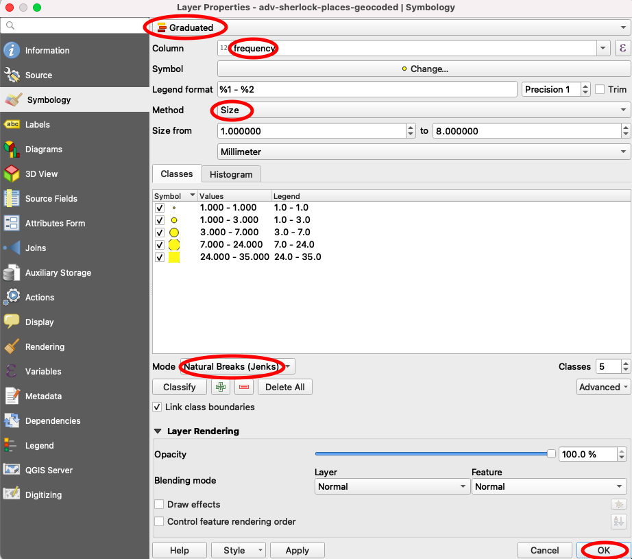 Figure 42. Make Proportional Circles.
After doing that, your map window should like similar to the following image. If you like the results, you can proceed to the layout window and finalize a pdf for exporting.
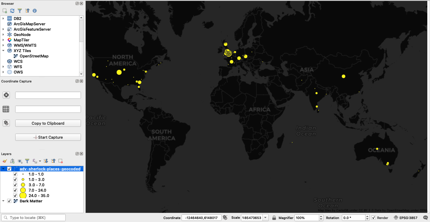 Figure 43. Proportional Circles Map.
Now, let’s try a heat map! In you properties settings, choose “Heatmap” in place of “Graduated”. Use “Reds” for the color ramp and set the radius and maximum values to 10. You can experiment with different values to see how they change the results at different zoom levels. For “Weight points by”, choose “frequency” and then move the rendering quality bar to “Best”. Finally, maximize the “Layer Rendering” dialog at the bottom, set the opacity to 33.3% and click “OK”.
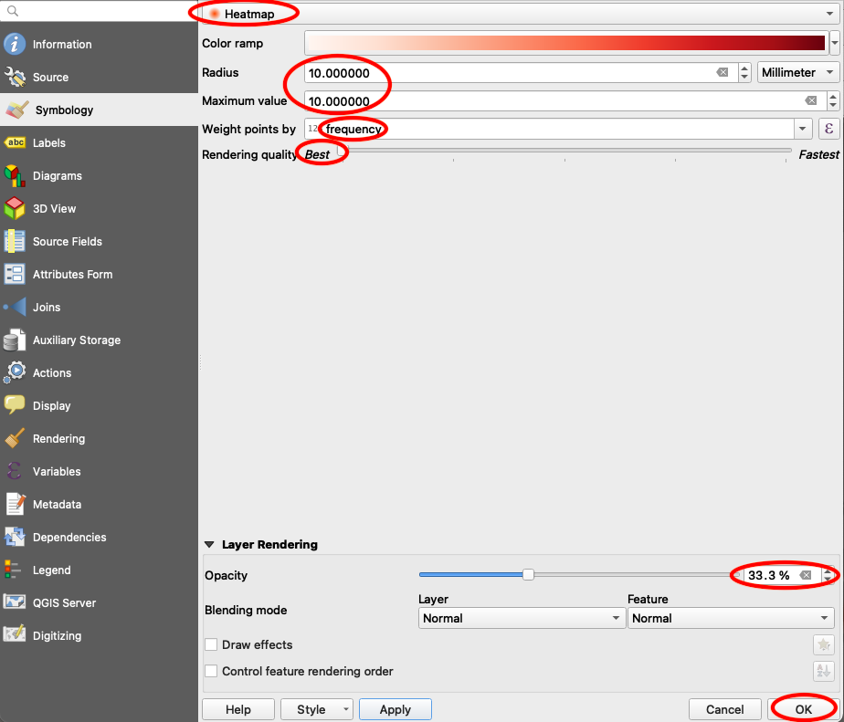 Figure 44. Making a Heat Map.
Returning to your map screen, you should see something like the image below. Again, if you like this, you can export a pdf in the layout window.
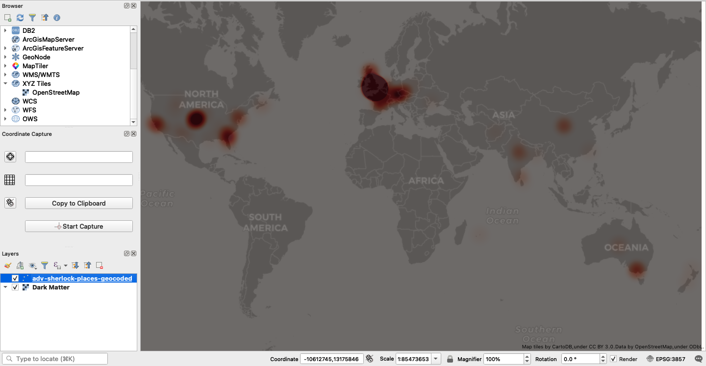 Figure 45. Heat Map.
Finally, let’s do some point in polygon analysis. Our goal is to total the frequency values for all points located within each nation and color code the result in a choropleth map. To do this, first let’s turn off the Dark Matter basemap. Next, drag and drop the “nations.geojson” file into the map window.
Now, navigate to Processing > Toolbox and search for a tool called “Join attributes by location (summary)”. In the dialog box, identify “nations” as the input layer and “adv-sherlock-places-geocoded” as the join layer. Select “contains” for the geometric predicate. Under “fields to summarize”, select “frequency” and select “sum” under “summaries to calculate”. Finally, click “Run”. Use the image below for guidance.
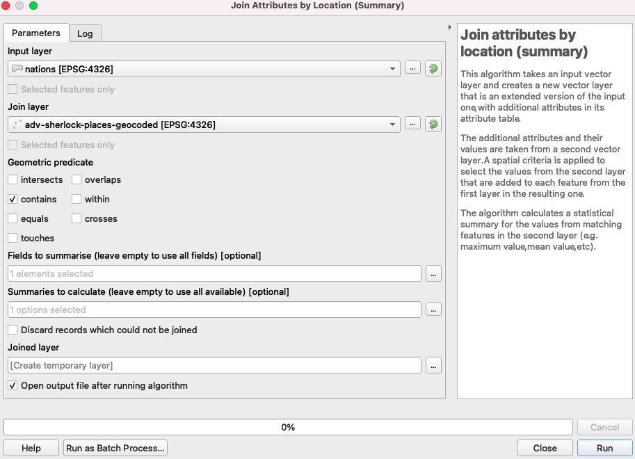 Figure 46. Point in Polygon Settings.
Next, in the Layers table of contents, turn off every layer except the new “Joined layer”. Right click this layer and choose “Open Attribute Table”. Click the “Open field calculator” button. Check “Update existing field” and choose “frequency_sum” from the dropdown menu. In the expression box, type:
if (“frequency_sum” is null, 0, “frequency_sum”)
*NOTE: You will actually want to type the expression above, rather than copy and paste. This will ensure that the quotation marks are correctly formatted.
Click “OK”. Next, click save edits and close the edit session by clicking the box that contains a pencil.
Now, close the attribute table and right click the joined layer once again. This time, select “Properties”. From the dropdown menu options, choose “Graduated”. Then, select “frequency_sum” for the column to be analyzed. Next, choose “Blues” for the color ramp. Next, select “Natural Breaks (Jenks)” for the mode of classification, click “Classify” and then click “OK”. Your map should look similar to the image below, but you can certainly play around with some more appropriate global equal area projections before finalizing and exporting to a pdf.
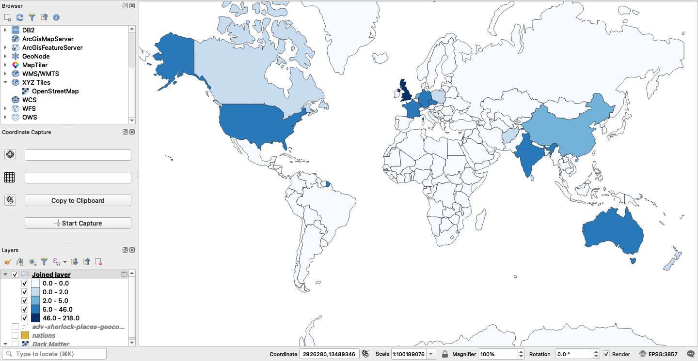 Figure 47. Choropleth Frequency Map.
Looking at these three maps, what could you say about Sherlock’s global sense of place? What might influence his familiarity with particular geographic locations, regions, and countries? How is it constricted and how is it broader than expected?
Step 4: Map a Network of Word Associations from The Adventures of Sherlock Holmes with Gephi
Now, we will load the adv-sherlock.gexf file from the “assets” subdirectory in the Gephi software you downloaded earlier. With this file, we will perform a visual network analysis to map associations between our words of interest from the text and their most similar relatives previously identified by our Word2Vec model.
Locate Gephi in your applications and open the software. Now, click “New Project”. From the options in the top bar, choose File > Open and locate your adv-sherlock.gexf file in your project folder. Click “Open”.
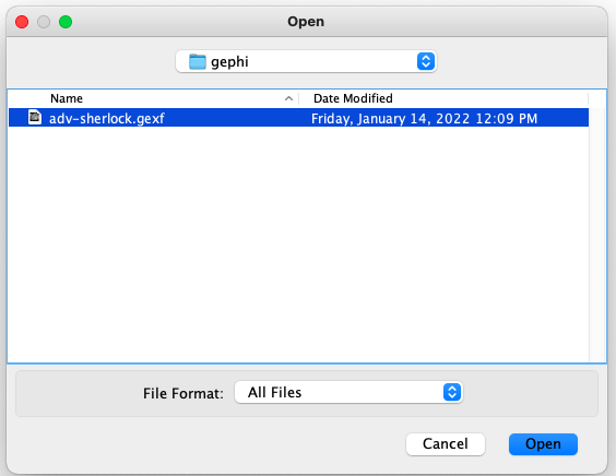 Figure 48. Open the gexf File.
Choose a “Directed” Graph Type and select “Append to existing workspace”. Click “OK”.
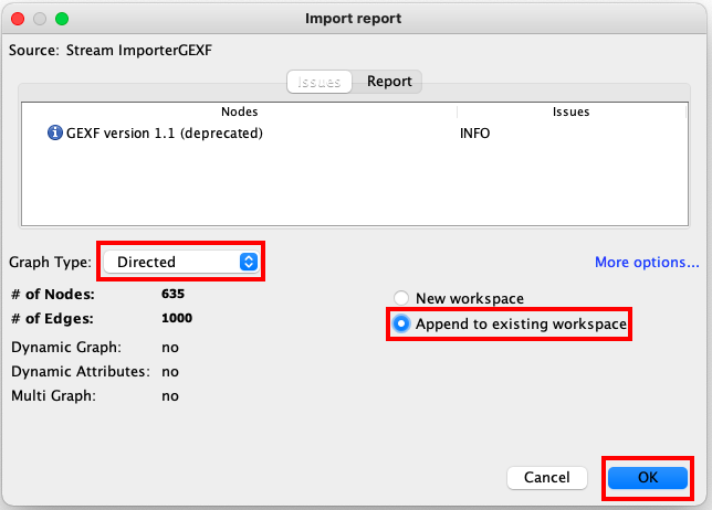 Figure 49. Import Settings.
Now, make sure you are in the “Overview” view. From the options at right, click “Run” next to “Modularity”. In the settings, choose “Randomize” and “Use weights” and click “OK”. You can close the resulting modularity report. This will classify our nodes cluster into new groups of closely associated words, called “communities”.
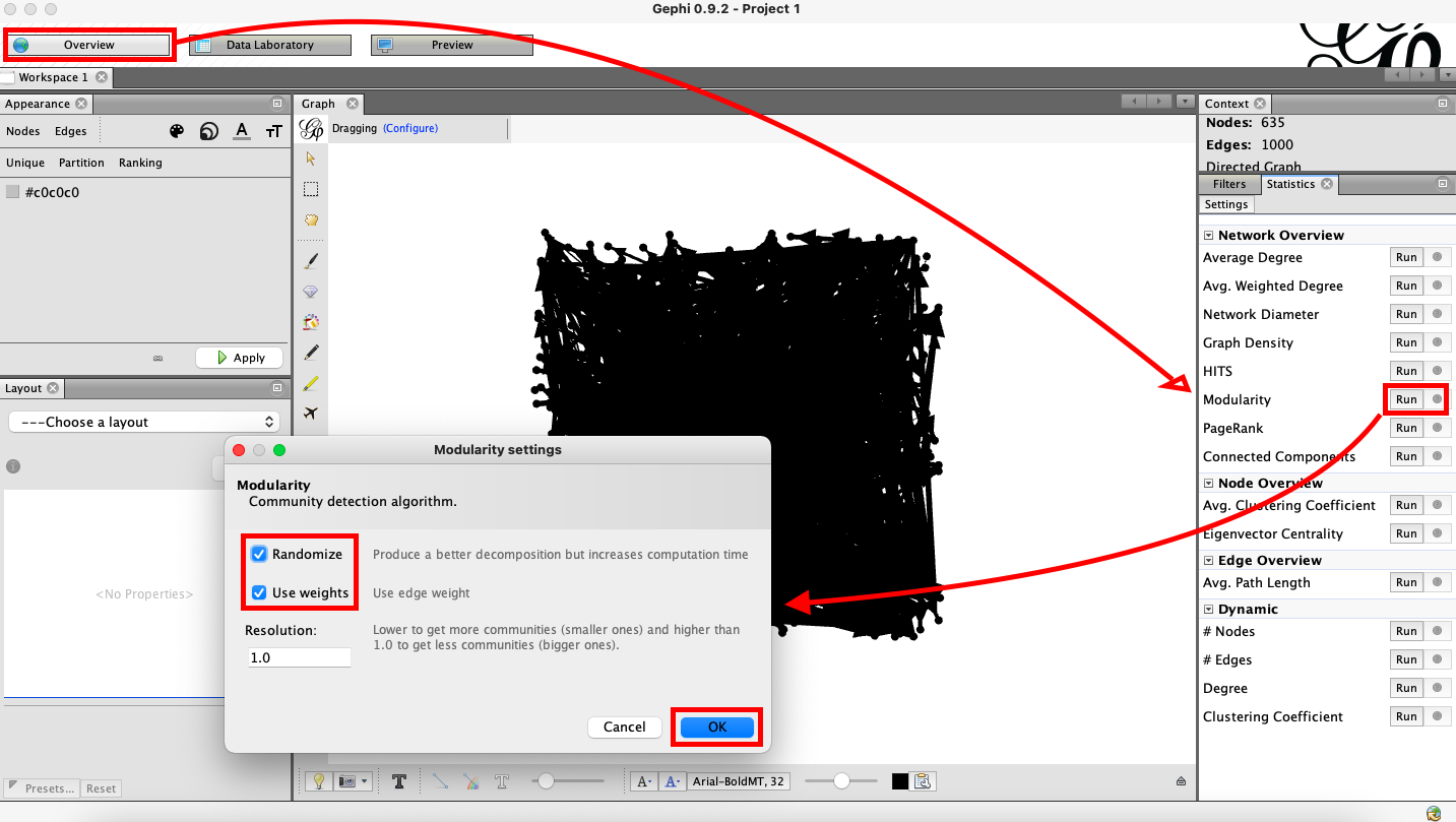 Figure 50. Modularity Settings.
Now, we will color code each node by its community. As shown below, under “Appearance”, select Nodes > Partition > Modularity Class and click “Apply”.
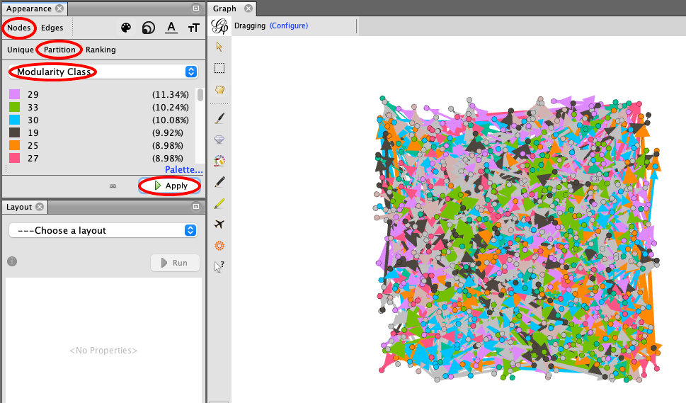 Figure 51. Appearance Settings.
Next, we will rank each node proportionally. Again, under “Appearance”, select Nodes > Ranking > Degree and click “Apply”. Follow the steps shown below.
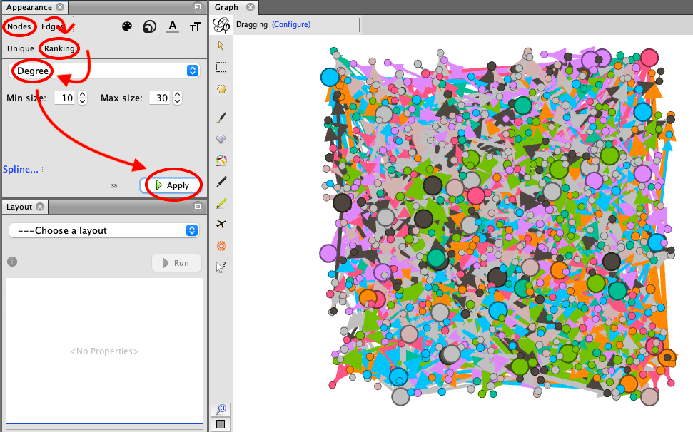 Figure 52. Node Ranking.
As you can see, this network is too crowded to be useful as a visualization. We need to change the layout of the network to avoid overlapping nodes and edges to improve legibility.
Follow the image below. Under the “Layout” options, choose “ForceAtlas 2”. Then, under “Behavior Alternatives”, choose “Dissuade Hubs”, “LinLog mode”, and “Prevent Overlap”. Finally, click “Run”. When you click “Run”, you will notice the network begin to change shape. You will also notice that the “Run” button has changed into a “Stop” button. As soon as you notice the changes to the layout slowing down, you can click “Stop” to freeze the network.
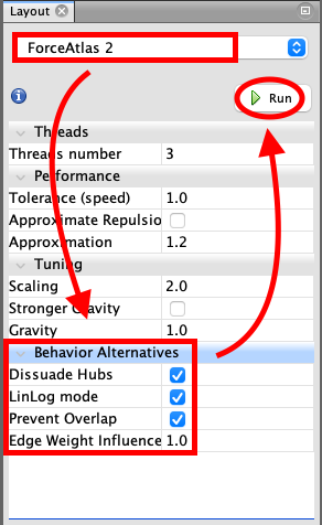
Figure 53. Changing the Layout Options.
Zoom out and you will notice that the network is much less tangled and dense. However, we still do not know which words are represented by these nodes.
Click “Preview” from the options at the top of the window. Next, under “Preview Settings”, change “Default” to “Text outline” and click “Refresh”. The window should populate with a labelled network, as shown below.
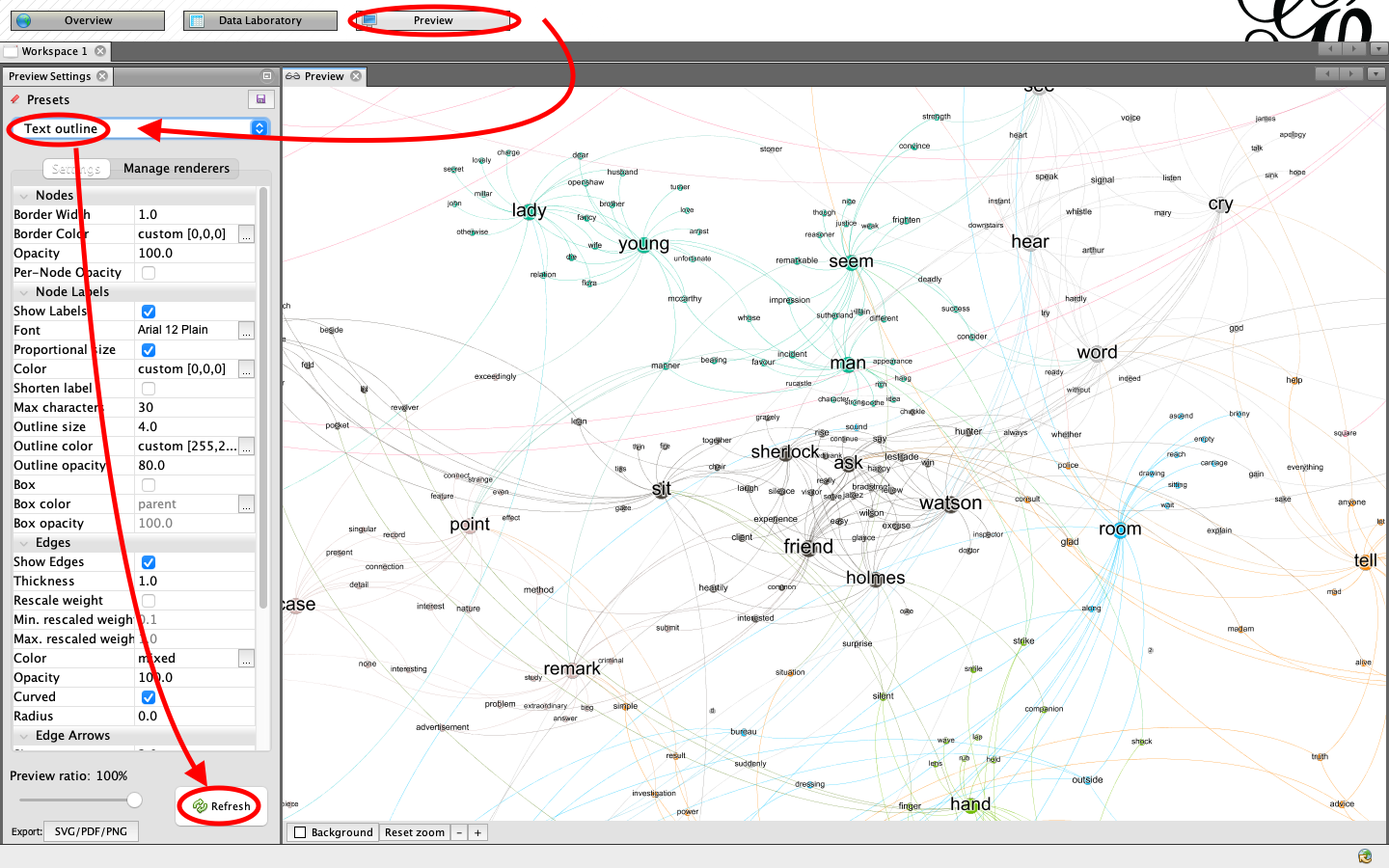 Figure 54. Changing the Preview Settings.
Let’s experiment with these settings some more to improve legibility. Under “Nodes”, set the opacity to 0. Under “Node Labels”, set font to Arial 18 Plain, color to parent, and outline size to 2. Under “Edges”, select “Rescale weight” and set the minimum to 0.1 and the maximum to 4. Finally, click “Refresh”. Try manipulating these settings until you are satisfied with the results.
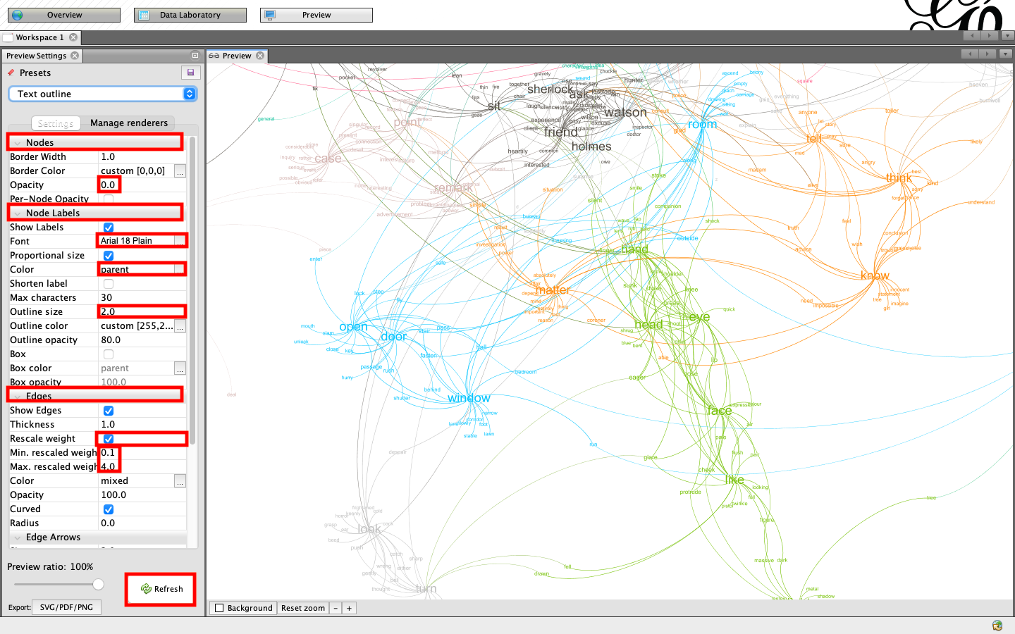 Figure 55. Resetting the Preview Settings.
Finally, we can export a pdf. Notice that there is an export button at the very bottom of the preview settings. Click this and export a pdf to your project folder.
Take a look at the results. This network maps connections between our selected words of interest and their most similar peers in the text. More connections between words generally brings them closer together in the network diagram. However, words without connections are often farther apart. Two words with a very strong connection to one another are symbolized with a wider line (edge). Communities, or subsets of nodes within the graph with denser connections to each other than to the rest of the network, are symbolized with different colors. Words, or nodes, with a larger number of connections are symbolized with a larger font. How might this mapped network help us to understand The Adventures of Sherlock Holmes? What themes from the text might we be able to glean from this visualization?
Conclusion
Through this tutorial, you have been given a cursory exposure to various forms of digital mapping and their potential applications in the humanities. I hope that this has deepened your interest in the subject and that you have gleaned a few exciting possibilities for digital mapping in your own work.